This is an online course on data visualization for upskilling professionals in all sectors running 16. May – 10. July 2022
Navigation
OverviewCourse Description
Teaching Approach
Topics & Schedule
Requirements, Fees and Waivers
How to apply
FAQs
Apply
Team
E-mail us
Online Course in Data Visualisation for Professionals
The University of Edinburgh is hosting a university-certified, 10-credit, online course in data visualisation with flexible schedule. The next course is planned from mid May 2023 to mid July and is dedicated to professionals in—among others—finance, the sports industry, the creative industry, journalism, education and the public sector. Further runs of the course later this year are in preparation.
The application deadline will be late April. Dates will be updated soon.
Info Sessions
Meet the organisers and join our open info session on Zoom (pw:Pd2ZW59n). In this session, we will give an overview of the course (access slides) and answer any questions. Sessions times are:
- dates and time to be defined
Pre-course Updates
You can express interest in the course and be kept updated by signing up here.
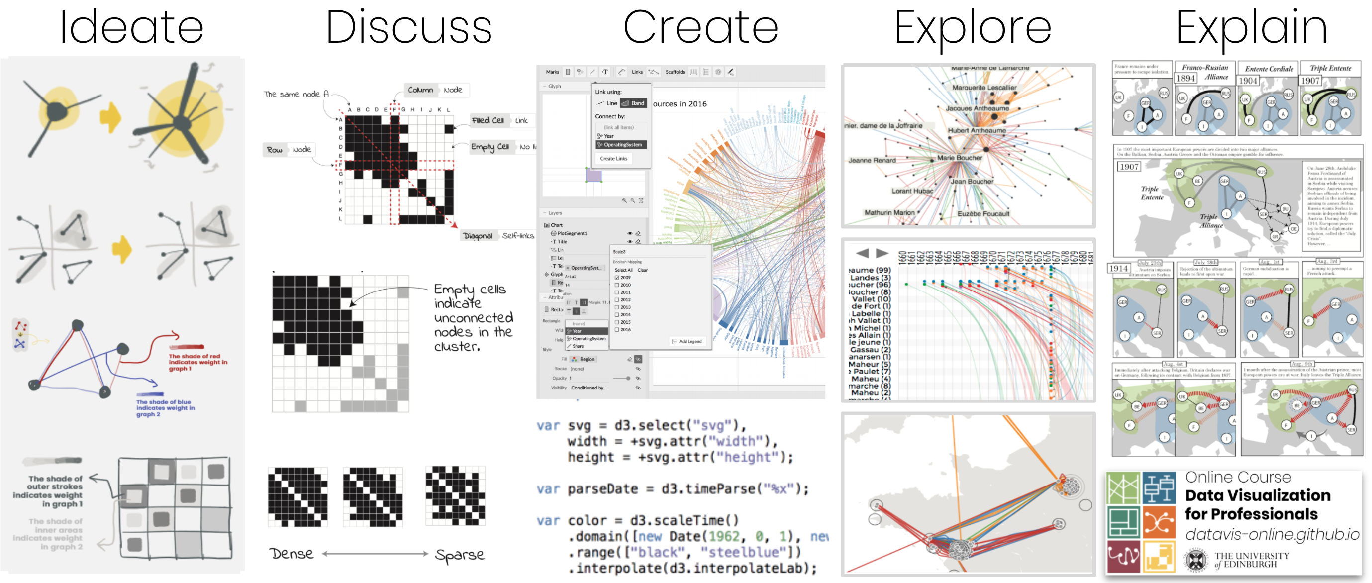
Course Content
This online course teaches how to
- visually explore data
- criticise data visualisations,
- design visualisations, and
- implement data visualisations.
It covers the fundamentals of
- human perception and data visualisation,
- exploratory data analysis,
- the importance of interaction in exploration,
- techniques for data visualisation (networks, temporal data, geographic data, etc..),
- storytelling and communication,
- tools for data visualisation, and
- evaluation.
With an aim to build skills that allow participants to directly apply their learning, the course features online videos and reading material, tutorials, drop-in sessions and complementary online teaching material. More about the course organisation and its schedule.
We encourage BYOD—Bring and work on Your Own Data projects (though we unfortunately cannot formally sign non-disclosure agreements). Alternatively, class examples will include open-access data on a variety of topical issues such as climate change, COVID-19, gender participation (e.g., the No Ceilings project (github repository), and Scotland’s Open Data Catalogues.
There are many other excellent sources for data available online, here are some of our favourites:
- Data is Plural - also available via a spreadsheet showing archived posts
- Data sources by OECD
- UNESCO statistics
- DATA.GOV.UK
- EU open data portal
- NHS Health & Social Care
- 538: Politics, Economics and Sports Blogging
- Kaggle
Learning Outcomes
- Analyse: Describe a challenge for a visualisation project and the reasons why visualisation is required.
- Structure: Break down the project with consideration for its context (target audience, usage scenario), potential tasks that the visualisation should facilitate, and the characteristics of the data set.
- Design+Implement: Create a visualisation through one of various media (website, interactive, infographic, etc.) and through a self-selected set of tools (e.g., Tableau, D3.js), to match the earlier-identified challenge.
- Evaluation: Critically reflect on a visualisation design and suggest constructive solutions.
- Apply: Competently apply a wide range of visualisation techniques and tools, informed by their particular features and drawbacks.
Takeaways
- A certificate to reflect a 10 credit-bearing course at Masters level (SCQF Level 11)
- Visual representation of your dataset that enables you to answer the challenge you defined around it before and during the course.
- Skills to develop further visual literacy to support data-driven work.
Browse further detail on the course structure.
Submit Application
Applications are now being accepted for the course. Please note that you must state that you are registering for the course Data Visualisation for Professionals in the “Supporting Statement” section of the application form.
Course Delivery Information
- Start Date: mid May 2023 (tbd)
- Course Duration: 8 weeks, complementing self-directed online learning with one hands-on session per week via a virtual classroom, in addition to a Q&A session to discuss recorded lectures and corresponding quizzes
- Total Hours: 50-100hrs (Lecture Hours 10; Tutorial Hours 20; Independent Study Hours 30-70)
- Hourly investment: 5-10hrs, including video lectures, reading, Q&As, project work.
- Method of Assessment: Coursework 100%, including submission of your final project.
- The course does not award grades, but is assessed as PASS/FAIL. You will however receive one-on-one and detailed written feedback on your project.
- Final submission deadline: mid July 2023 (tbd)
- Results communicated: October 2023